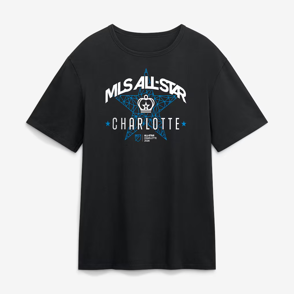
MLS ALL-STAR 2026
Service | Apparel Design, Consultancy
High Intensity
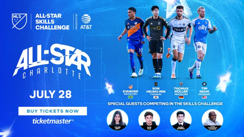
MLS All-Star is a week-long celebration built around the league’s leading players. For 2026, Charlotte hosted a full programme of events culminating in the MLS All-Stars facing the LIGA MX All-Stars at Bank of America Stadium on July 29. The week also included the Skills Challenge, MLS NEXT All-Star Game, fan festivals, community events, partner activations and retail experiences across the city.
This concentration of players, supporters, media and commercial partners created a significant consumer products opportunity. The merchandise needed to feel specific to the occasion, rooted in Charlotte and elevated above standard club product. It also had to work across trainingwear, fanwear, collectibles and wider event communication, reaching different audiences through multiple licensees and product categories.
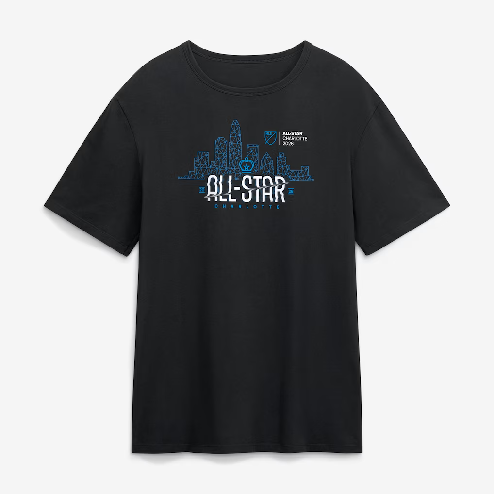
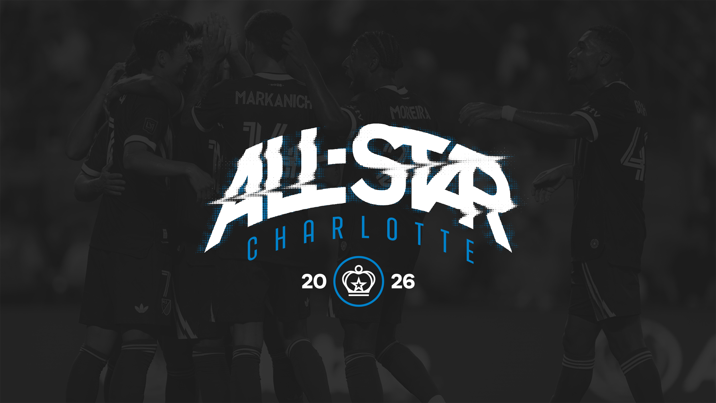
High Intensity was developed as the central creative language for the event. The direction combined expressive typography, bitmap texture, movement, depth and radiating energy with an elevated interpretation of Charlotte’s identity as the Queen City.
Creative Direction
The creative direction was shaped by three core inputs: contemporary graphic and fashion trends, the brief to communicate energy, and the visual character of Charlotte. Energy was expressed through movement, depth and radiating bitmap texture. Typography was warped and condensed to create a sense of intensity across each composition. Bitmap treatments gave the graphics a more tactile and expressive finish, helping the event identity feel distinct from previous years.
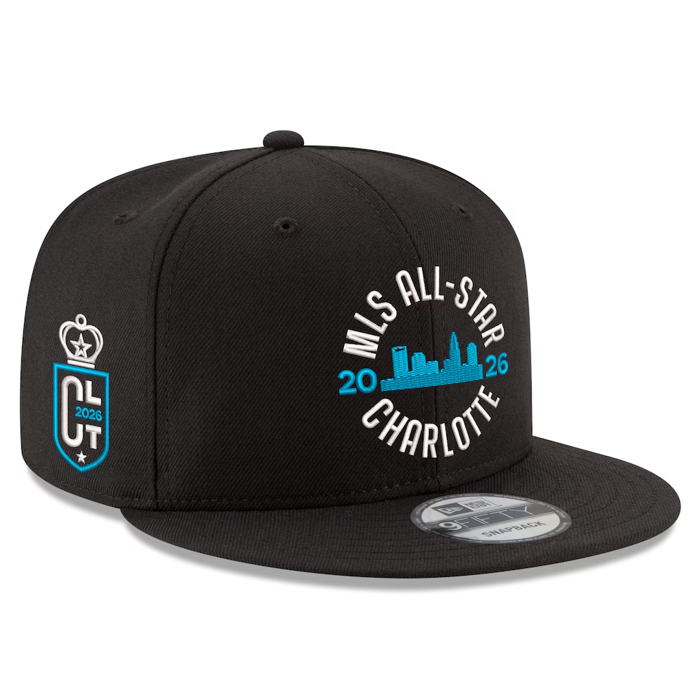
Charlotte influenced the direction through regal and heritage-led references. Seal compositions echoed the city’s civic identity, while arched typography introduced the familiarity of a heritage brand. These references were treated through a modern graphic lens, giving the system a sense of occasion without becoming overly traditional. The colour palette also expanded beyond the host club’s core colours. Secondary colourways created greater distinction from Charlotte FC merchandise and gave licensees more freedom across the wider assortment.
Design System
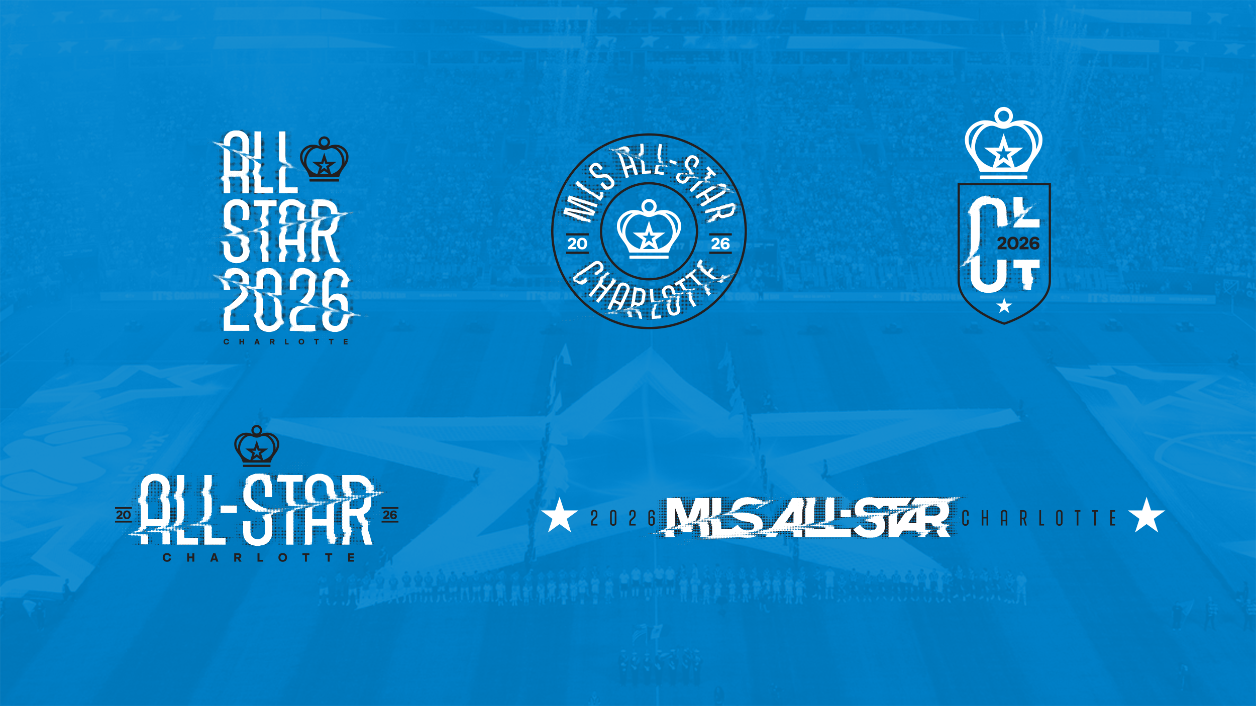
The system was built around a consistent set of typographic and compositional principles.
Two typefaces their own customisation techniques, allowing different artworks to retain a shared character. Hero, stacked, seal, crest, linear and extended formats gave licensees a range of options for different compositions and placements.
The same visual devices appeared throughout the toolkit:
Warped typography
Radiating energy
Layered depth
Bitmap texture
Heritage influenced compositions
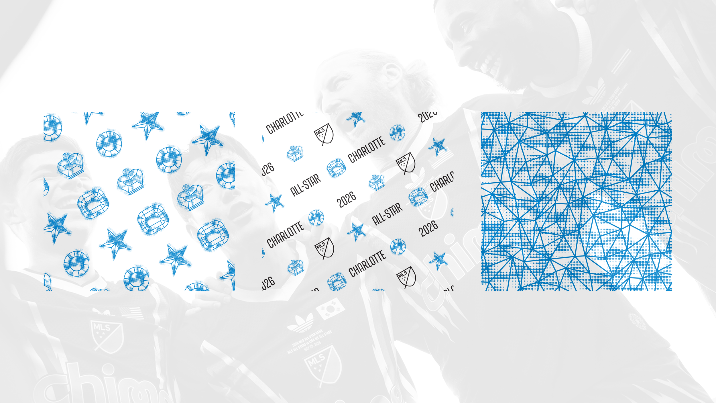
Crown, star and year iconography
Jewel and crystal pattern structures
These elements created a recognisable family across the full range while allowing each application to carry its own level of expression if it were to be used in isolation.
Built for Licensees
Licensees were given substantial creative freedom within the direction. The toolkit included production ready artwork alongside wider visual principles and application guidance. Partners could create original graphics and products, while using the system in a way that remained consistent with the intended direction. This approach gave the final assortment greater variety and allowed each licensee to bring its own product expertise into the range.
Product Positioning
The range was developed to feel appropriate for a one off football moment following the 2026 FIFA World Cup. The ambition was to create product with a stronger sense of occasion and visual value than standard club merchandise. The direction supported accessible fanwear alongside elevated fashion and culture led applications techniques, giving the event a broader and more distinctive retail presence.
Beyond the Event
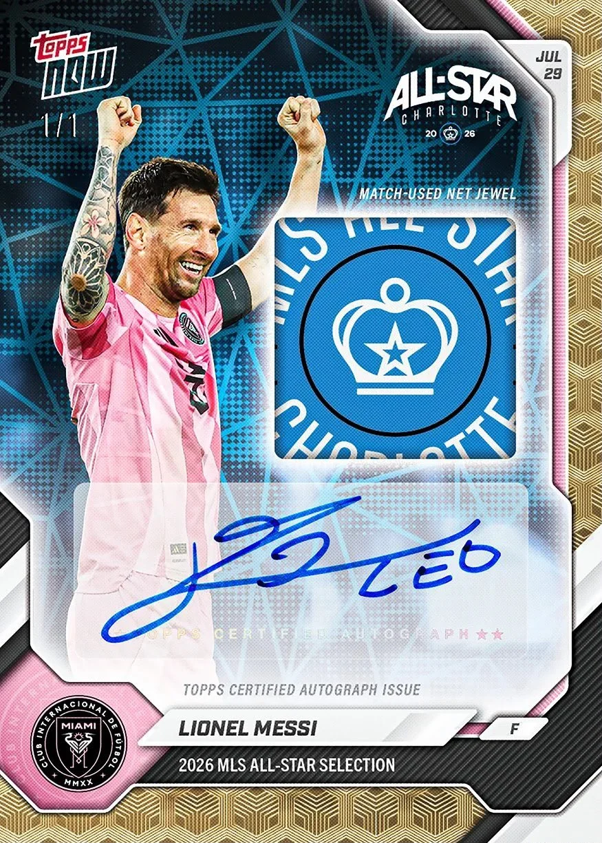
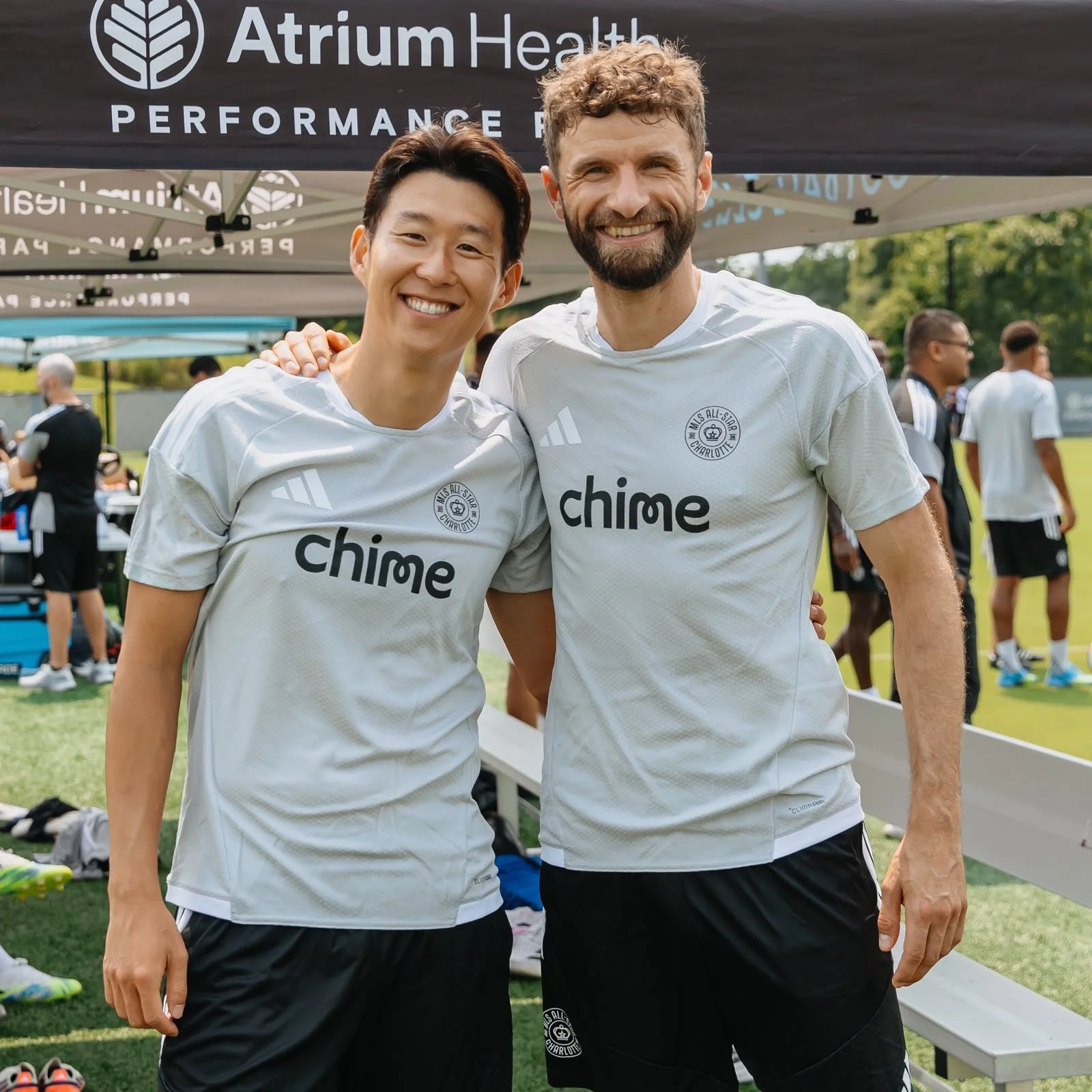
High intensity extended beyond consumer products and became part of the wider MLS All-Star campaign across digital and in market touch points with the final artworks appeared across trainingwear, digital communications, partner activations, collectibles and physical event locations. MLS and its partners adapted the system across different channels, creating a stronger visual connection between the merchandise programme and the broader event experience This wider use demonstrated the value of building a consumer products direction with enough clarity and range to influence a campaign and its content. The end product gave different internal teams a shared visual language while allowing each execution to respond to its own format, audience and purpose.
The same principles can support a full annual merchandise cycle. A clear overarching direction can establish the wider narrative, with individual tentpole moments introducing their own expression within the same family. For clubs, leagues and sports organisations looking to create a more coherent approach across merchandise, Dilley Studio develops creative direction and scalable design systems built for multiple partners.
Interested in finding out more about this project or want to enquire about any of our services? Click the link below and fill out our contact form.
Action Shots: