WREXHAM AFC BRAND DEVELOPMENT
Service | Branding, Consultancy
A goal of creating more flexibility within the Wrexham AFC brand for merchandise and media, while preserving consistency and integrity.
With Wrexham AFC’s remarkable rise in recent years, the club has seen rapid growth, on and off the pitch. Interest in partnerships and from sponsors has surged, creating many exciting opportunities but also new challenges. With so many external collaborators now engaging with the brand, maintaining a consistent and professional identity has become more important than ever before.
To protect the club’s image, it was essential to standardise the brands foundation. This meant ensuring that the use of logos, colours, and typography remained clear and cohesive no matter who was going to be using them or where they appeared. It was also important to evolve and formalise secondary and partial logos to allow third parties access to a wider array of logos beyond the club crest.
The project began with a deep dive into Wrexham AFC’s existing identity. This involved analysing current colours, brand assets, understanding the club’s fan culture, exploring the local town, and assessing how the brand appears across kits, merchandise and both digital and physical media.
From this foundation, a clear set of rules around how the club crest should be used, covering the shades of colour used, how it is applied on different background colours, as well as guidance for single-colour usage.

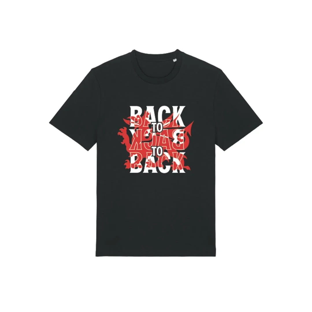
Secondary & Partial Marks
After the standardisation of the club crest and the establishment of consistent brand colours and rules, the next step was to formalise the use of partial marks and develop new secondary logos. A series of supporting graphics were created by extracting elements from the crest: Dragons and Football, standalone Prancing Dragon. The Dragons and Football mark can already be seen in the renderings of the new Kop Stand as part of The Racecourse Ground development.
In addition, a Welsh Dragon mark was created. This references the red dragon motif found on the floor outside The Racecourse Ground. The partial and secondary marks can be used independently or alongside the main crest and other brand assets, offering greater flexibility and variety across merchandise, digital platforms, and promotional materials.

Wordmarks
Typography plays a crucial role in shaping a football club’s visual identity. The choice of fonts and how they are applied has a significant impact on how recognisable a club brand is. As a starting point on this part of the project, a clear typographic hierarchy was developed to ensure coherence across all applications, from digital platforms to merchandise and in stadium.
This typographic foundation led to the creation of three new wordmarks: Wrexham AFC, the Welsh-language version Wrecsam CPD, and Red Dragons. Each was crafted with distinctive design details that tie back to the club. The arched layout of the wordmarks mirrors the curve of the main stand at The Racecourse Ground while the subtle drop of the first and last letters nods to the classic “Wrexham Lager” signage. The ribbon element, with pointed ends references a dragon’s wings, a visual link to tie in the club’s nickname.
As with the secondary and partial marks, together, these wordmarks provide the club with a flexible set of branding tools that can be used either on their own or in combination with the crest and other brand assets.

Guidelines Document
Following the completion of the analysis and creation phase, a usable guidelines document was created for the club to send to any third party wanting to use the brand.
Action Shots: